If your home feels a bit flat lately, 5-min wall swaps can be the quickest way to shift the mood without repainting, buying new furniture, or turning your weekend into a renovation project. Walls sit right in your line of sight, so even small changes to colour, texture, and scale can make a room feel calmer, brighter, cosier, or more put-together in minutes.
The best part is that these swaps work in real homes, not just staged interiors. You can use what you already own, rotate pieces between rooms, and make choices that suit your light levels and layout rather than fighting them.
This guide gives you a simple method, room-by-room ideas, and a sizing and placement system that helps your walls look intentional.
Expect practical, low-mess changes that still feel design-led: better balance, smarter colour impact, and fast upgrades that make your space feel fresh the moment you step in.
Why tiny wall changes can change the whole mood
When you alter what’s on a wall, you alter the room’s “visual temperature” before you change anything else. Your eye reads large vertical surfaces as mood-setters, so a lighter print can feel airy, a darker piece can feel grounded, and a warm-toned image can make a cool room feel more welcoming.
Walls also interact with light. In a room with limited daylight, glossy glass frames can bounce light around, while heavy matte pieces can absorb it and make the space feel quieter. Neither is “better”; it’s about choosing the right effect for how you want to feel in that room.
What to notice first: light, colour, and contrast
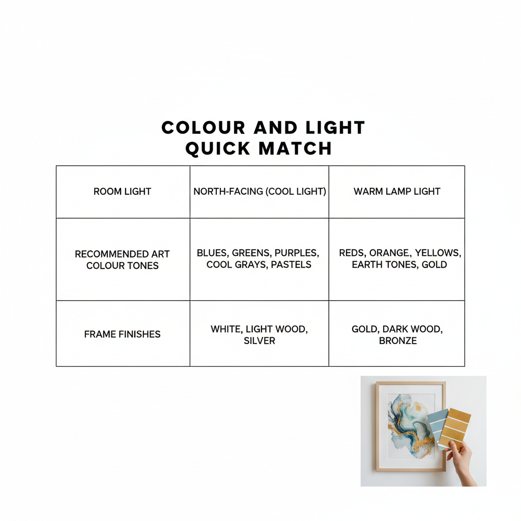
Before swapping anything, take 20 seconds to look at the room at the time you use it most. Morning light, late-afternoon shade, and evening lamps all shift colour. A print that looks crisp at noon might look muddy under warm bulbs, while a warm-toned artwork can glow beautifully at night.
- Low light: choose lighter backgrounds, higher contrast, and reflective framing (glass or a pale frame) to lift the space.
- Bright light: choose mid-tones and texture (linen mat, wood frame) so the wall doesn’t feel stark.
- Cool-feeling rooms: add warm accents (terracotta, honey, blush, sand) through art or mats.
- Warm-feeling rooms: add calm balance with cooler accents (sage, denim, charcoal, soft white).
The 5-minute wall swap method (so it’s fast, not stressful)
Speed comes from reducing decisions and keeping the swap physically simple. You’re not redesigning the entire room; you’re changing one focal point to nudge the mood. The method below keeps the mess low and the results consistent.
If you do this regularly, you’ll start to build a small “wall wardrobe”: a few pieces and accessories that you can rotate to suit seasons, guests, or just your own energy.
Keep a tiny wall-swap kit
When everything you need lives in one place, the swap stays genuinely quick. You also avoid half-finished walls and extra holes, which helps your home look calm even mid-change.
- Measuring tape (in cm) and a pencil
- Removable picture hooks/strips for lightweight frames
- A microfibre cloth (for glass and dust)
- Two spare frames (one small, one medium) for easy print rotation
- A roll of low-tack tape (useful for temporary layout marking)
Two rules that prevent “almost right” placement
Most quick wall updates fail because the piece is slightly too high or too small, which makes the room feel uneasy even if the artwork is lovely. Use these two rules and you’ll land in the right zone quickly.
- Height rule: hang the centre of the artwork roughly at eye level (about 145–150 cm from the floor for many homes), then adjust slightly for sofas, headboards, or tall ceilings.
- Width rule: over furniture, aim for artwork that’s around two-thirds to three-quarters of the furniture width so it feels connected rather than floating.
5-minute swaps that work in any room (with mood results)
The most reliable fast swaps are the ones that change colour balance, scale, or texture without changing the whole layout. Choose one aim per swap: brighten, calm, energise, or warm up. Then select the simplest wall change that hits that aim.
For a quick browse of modern pieces that suit speedy refreshes, you can treat 5-min wall swaps as a starting point for ideas on colour, style, and scale.
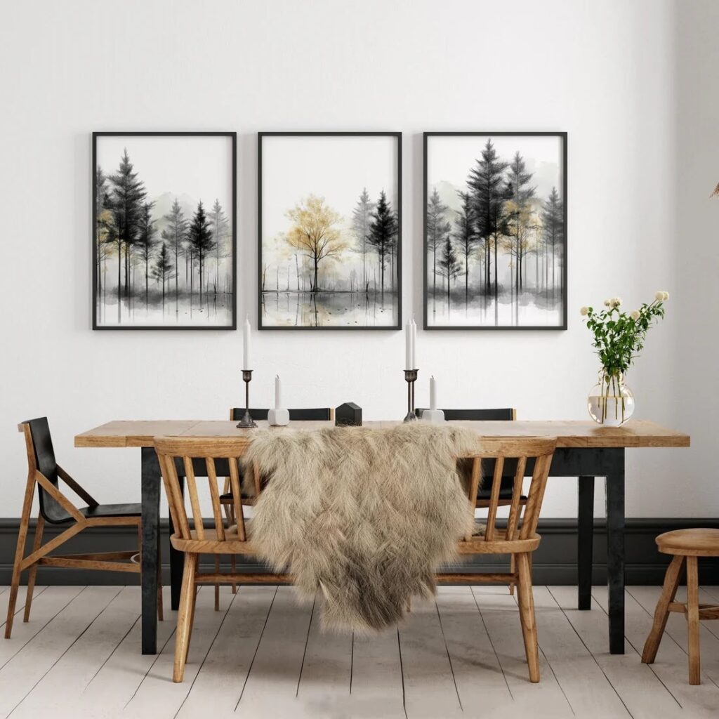
Living room: make the seating area feel finished
In living rooms, the wall behind the sofa (or the main seating) usually carries the “story” of the space. A swap here changes the room instantly because it’s your main visual anchor, especially when you walk in or sit down.
- To brighten: replace a dark, busy print with a lighter background and clear shapes; add a pale frame to echo daylight.
- To feel cosy: swap in warmer tones and a thicker frame (wood or matte black) to add visual weight.
- To feel modern: switch to one oversized piece with strong negative space rather than many small items.
- To feel calmer: choose soft gradients, landscapes, or abstract shapes with fewer hard edges.
Bedroom: lower contrast for better rest
Bedrooms often benefit from gentler contrast because high-contrast walls can keep your brain “on”. The quickest mood shift is to replace sharp blacks/whites with mid-tones and softer edges, then echo that calm through texture.
- Swap glossy frames for matte or wood to reduce glare from lamps.
- Choose artwork with repeated curves or soft shapes to relax the visual rhythm.
- Use a textile wall piece (woven, macramé, or fabric banner) for instant softness.
- Keep the palette to 2–4 main colours so the room feels settled.
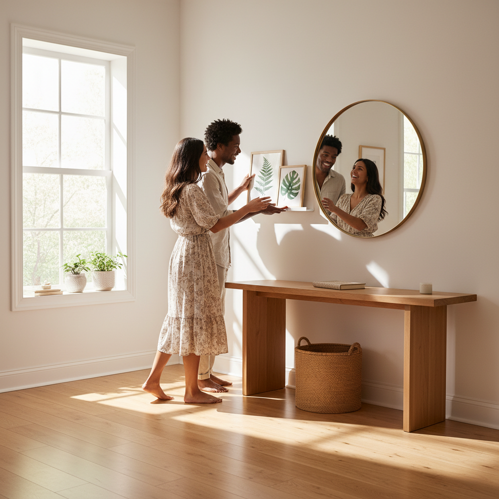
Hallway and landing: add a “welcome” moment
These spaces are short on furniture, so the wall is the main feature. A hallway swap is often the fastest win because you can change one or two pieces and transform the tone of the whole home on entry.
- Narrow hallway: pick a vertical piece to pull the eye up and reduce the “tunnel” feeling.
- Dark landing: use lighter artwork and a reflective frame to bounce light.
- Busy entrance: keep artwork simple and add one textured element (a sculptural wall hook or a textile piece).
Kitchen or home-working corner: energise without clutter
In functional zones, wall art should support focus and flow. A small swap can give you energy through colour, but the lines and layout should stay clean so the space doesn’t feel chaotic.
- Use a graphic print with two strong colours rather than a highly detailed scene.
- Try a pair of small frames in a tidy grid to create order.
- Add a slim picture ledge so you can rotate pieces without new holes.
Scale and layout: the part that makes swaps look intentional
Even a beautiful print can look wrong if the scale doesn’t match the wall and furniture. The good news is you don’t need design training; you just need a repeatable sizing shortcut and a layout that suits your wall’s shape.
If your mood goal is “calm”, lean towards fewer, larger pieces with breathing space. If your mood goal is “lively”, use a gallery wall with varied sizes but consistent spacing or framing so it still feels tidy.
Quick sizing guide (no guesswork)
Use this table as a fast reference, then adjust based on ceiling height and how close you sit to the wall. In small rooms or flats, slightly smaller can work as long as you keep the piece visually connected to furniture.
| Location | Fast sizing rule | Spacing tip | Mood effect |
|---|---|---|---|
| Above a 180 cm sofa | Artwork width 120–140 cm (or a set with similar total width) | Keep 15–20 cm above the sofa back | Balanced, “finished” look |
| Above a double bed headboard | Artwork width 110–130 cm, or two pieces 50–60 cm each | Keep 20–25 cm above the headboard | Calm, hotel-like |
| Hallway feature wall | One vertical piece 50–70 cm wide, 70–110 cm tall | Centre at roughly 145–150 cm from the floor | Welcoming and uplifted |
| Desk or kitchen nook | One medium piece 40–60 cm wide, or a neat pair | Leave 10–15 cm above furniture | Focused and tidy |
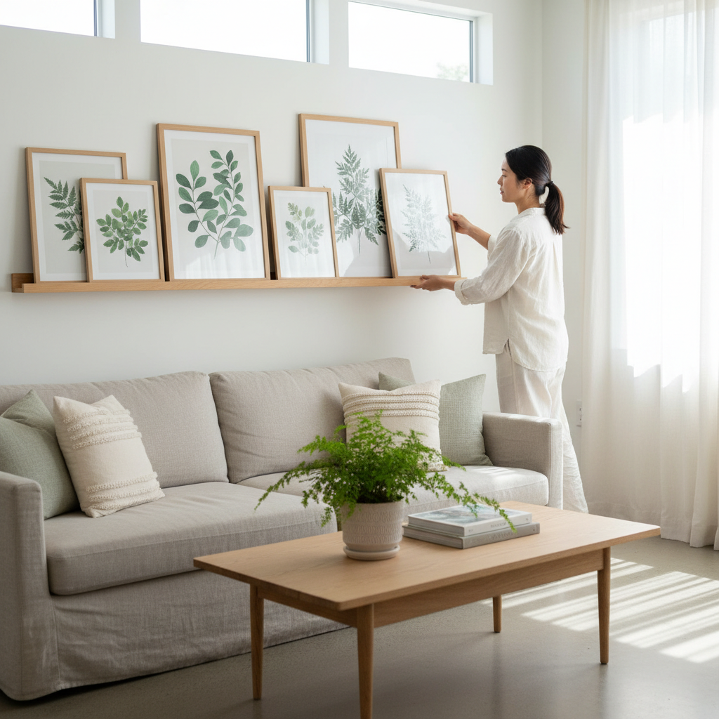
Gallery wall in 5 minutes: the “frame family” trick
Gallery walls can be quick if you treat them as one unit. When the frames share a finish (all oak, all black, or all white), you can mix art styles and sizes and still create order through repetition.
- Keep spacing consistent: 5–7 cm between frames is a reliable range.
- Start with the anchor: place the largest piece first, then build around it.
- Repeat a shape: two or three matching sizes makes the collection feel intentional.
- Use one “rest” piece: a lighter, simpler print gives the eye a pause.
Texture and materials: swap the feel, not just the image
If you want a mood change that feels “real” rather than purely visual, change texture. Texture affects how light moves across a wall, and it changes the sense of warmth or crispness even when the colour palette stays the same.
A smooth glass frame reads clean and modern, a wood frame reads warm, and a textile piece reads soft and grounded. You can use this to fix rooms that feel cold, echoey, or too sharp.
Fast material swaps and what they do
- Glossy frame to matte frame: reduces glare, makes the room feel calmer in evening light.
- Thin frame to chunky frame: adds visual weight and makes the wall feel more anchored.
- Paper print to canvas texture: adds softness and depth, especially in neutral rooms.
- One flat print to layered look: add a mount/mat to create breathing space and a more curated feel.
- Hard surfaces to soft surfaces: add a textile wall hanging to balance wood floors, tiles, and glass.
Colour strategy for instant mood shifts (without repainting)
When you don’t want to repaint, artwork becomes your colour tool. You can introduce a new accent colour, soften a harsh white wall, or cool down a warm room using one piece as the “colour cue” and then echoing it in one or two small items already in the room.
The key is restraint: one main colour change on the wall, then two small repeats elsewhere. That keeps the room coherent and stops the swap from feeling random.
Three easy colour moves
- Mono lift: keep the artwork mostly neutral, but add one colour accent (sage, rust, ink) to shift the mood gently.
- Complement balance: if your room is heavy in warm tones, add cooler art (and vice versa) to create a comfortable mix.
- Contrast pop: use strong contrast in a single piece to add energy, then keep everything else quiet.
Common mistakes that slow you down (and how to avoid them)
Quick swaps stay satisfying when you avoid the few mistakes that make walls look “off”. Most of these are easy fixes: a small height adjustment, fewer competing colours, or better scale over furniture.
Use the checklist below as your final 30-second scan before you step back and enjoy the new mood.
30-second wall swap checklist
- Is the centre of the piece at a comfortable eye level for how you use the room?
- Does the artwork connect to nearby furniture in width and placement?
- Is the colour temperature working with your main light source (daylight or lamps)?
- Is there enough breathing space around the piece, especially on a busy wall?
- Have you kept the room to one clear “mood job” (calm, bright, cosy, energetic)?
Conclusion
A genuinely quick wall refresh comes down to three things: choose an aim (brighten, calm, cosy, energise), pick the right scale for the wall and furniture, and use colour and texture to work with your light. Once you have a small kit and a simple sizing rule, these changes stay easy and repeatable.
If you keep a few interchangeable pieces ready, wall updates become a low-effort habit that makes your home feel looked-after, even on the busiest weeks.